When working with graphical objects you will see additional and different formatting options than we had with just crosstabs. Furthermore, different graphical object types may have slightly different formatting options.
The following example will be based on a crosstab where we are looking at Revenue, Profit and Profit Margin with Time.
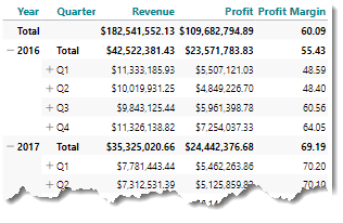
We will turn this crosstab into a column chart and immediately we can see that we have a typical problem with value scales: The Profit Margin columns are simply too small to be visible together with the Revenue and Profit columns.
The solution is to work with a secondary measure axis on the right hand side of the object – and then let Profit Margin work on the new right axis, while Revenue and Profit stays on the left axis.
While we try to implement this solution, we will get by many of the other formatting options related to graphs.
At first, we will need to start working with properties for this chart.
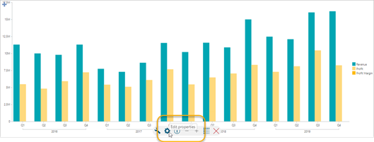
This will open the Chart dialogue:
Dialogues for other graph types will have more or less the same options.
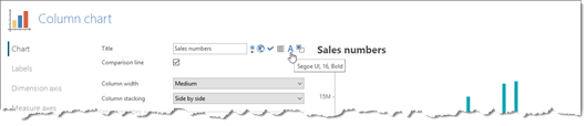
Starting from the top, the Chart settings, you can add a title to your graph. The title can also be formatted via the “A” button.
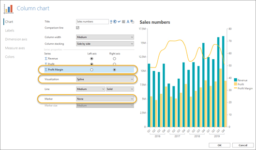
A bit further down on Chart settings tab, you can work with series and their individual visualization.
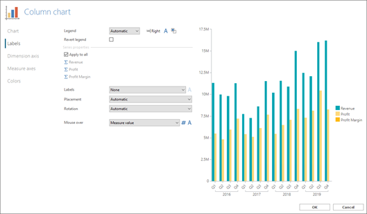
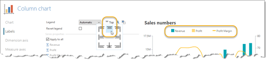
On the Labels settings tab, the first thing is related to the Legend. The Legend will by default be placed to the right, but you can move it to any other location around the graph itself.
When you start working with labels, you should consider if you need the same label for all series of data – in this example, for three series of data.
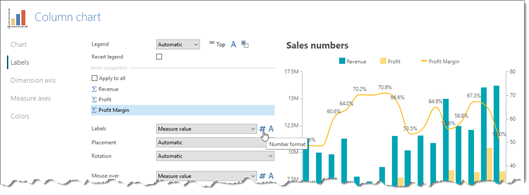
In the screenshot below, Profit Margin has been selected as the only one to receive a Label (Measure value, in this case). Furthermore, the number format of this label has been modified with the # button.
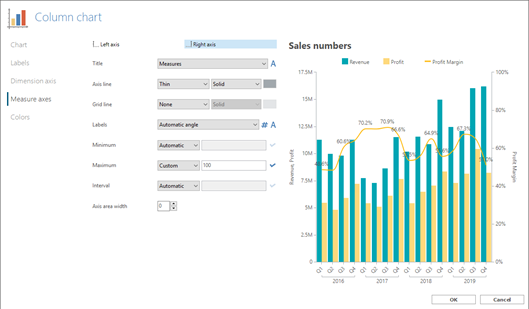
In our current scenario, the Measure axis tab is quite important as well.
Here, we will change settings for:
- Title
- Label number format
- Custom Maximum (remember to apply with the checkmark button).
Finally, we may look into colors. Colors can be changed in many ways, but an easy way to control the current colors is to click the pencil button on this tab.
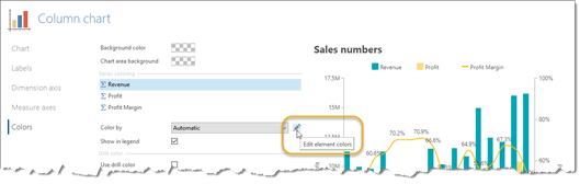
To change the colors in the current object, choose the Assign color option:
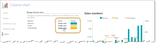
Warning: If you change colors via the Shared color option, you will change color not just for the current object, but for all objects with that measure in all analyses created by all users. In other words, the Shared color option has wide consequences and should only be used when you actually want a measure to change color across the entire TARGIT solution.
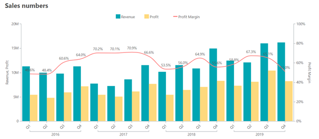
The final result may look like this:
Comments
Please sign in to leave a comment.