This dashboard was created for our maps visualization contest and it contains a lot of tips and tricks that really can help you in your daily work creating dashboards with TARGIT.
This tip - based on this dashboard - is around intelligent use of color on maps (and other objects).
Author of this dashboard: Stephan Fehrmann from TARGIT partner GOB
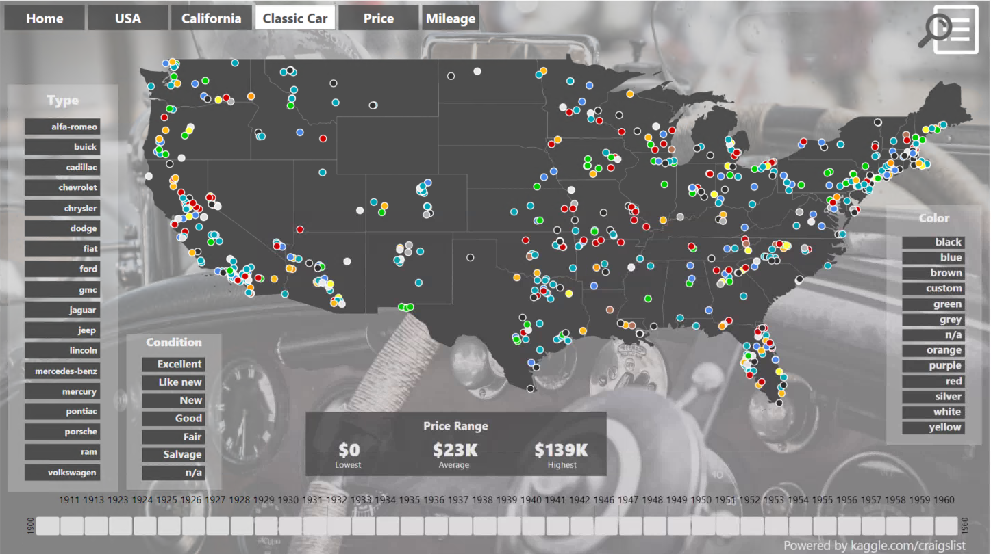
This is actually not just one dashboard - but a full portal giving you insight into the used car market in the US - if you take a look at the dashboard - don't hesitate to use the menu in the top - cause there's a lot of great stuff here besides the dashboard shown above.
When you first look at this dashboard, you might be a little confused by the many colors used on the map - but theres a good point to this - it's simple showing the you locations where you can find a car of a certain color.
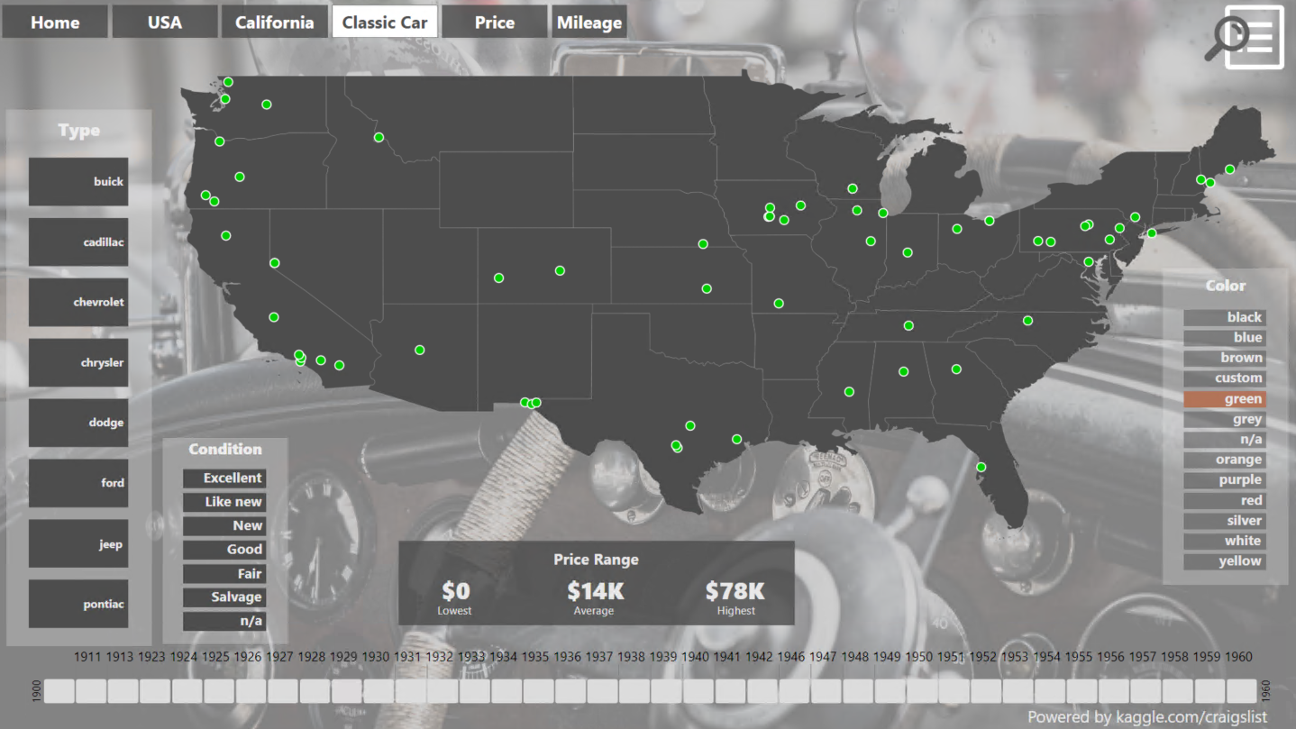
So a green dot shows you the location of green cars - and you can even limit the map to show only these by clicking the slicer on the right hand side:
So - the clever thing here is the control of colors.
TARGIT supports a number of ways of controlling colors on your visualizations.
- You can go with color sequences where visualizations that shows multiple series of data will start using the color sequence from color 1 every time
- You can have shared colors that are tied to measures or dimension members
- You can have local object colors that are set on that particular object
If you we're to use a color sequence in this map, you wouldn't have the same intuitive understanding of this dashboard.
A color sequence uses the color from the color sequence one by one - and if you would drill into a certain color, you would get the first color of the color sequence (which would be the same regardless of which color you have drilled on).
So the author of this dashboard decided to assign a color to a dimension member - let's look at the properties concerning colors:
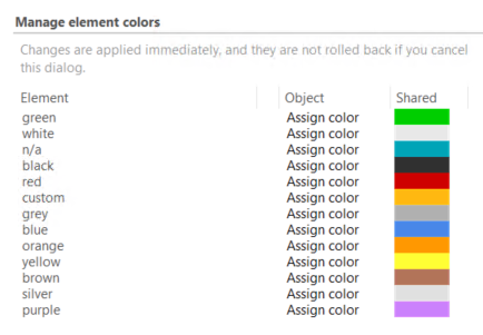
So this is clever - it means that the color green is associated with the value green - and that makes sure that the end-user gets the very best intuitive experience when he or she drills on colors in the dashboard.
This approach could actually be applied everywhere you have series of data. A stacked barchart, a barchart, linechart or columnchart with multiple series would also benefit from this logic - making sure that the colors remain the same when drilling on that particular series is done!
Note - theres another great tip based on this portal:
Comments
Hi Niels,
Do you know how I can get a risk level per country on the world map? I have a table without measures with country and country risk (High (red), Moderate (yellow), Low (green)). I have to select a measure for the map.
Only thing I can think of is to make a measure where Low = 1, Moderate = 2 and High = 3. But maybe you have a different/better idea.
Thanks!
Any update?
Thanks!
Hi Frank,
I was wondering, what if you added the country dimension to the vertical axis in a crosstab and the risk dimension (Low, Medium, High) to the horizontal axis plus any of your existing measures? Will that show data only in the High column for a High risk country and blank in the other two columns, etc.?
If that is true, then you can add a calculated column:
This should produce calculated values 1, 2 or 3 for Low, Medium or High respectively.
Turn the crosstab into a Map and add color agents according to the calculate values.
BR / Ole
Please sign in to leave a comment.