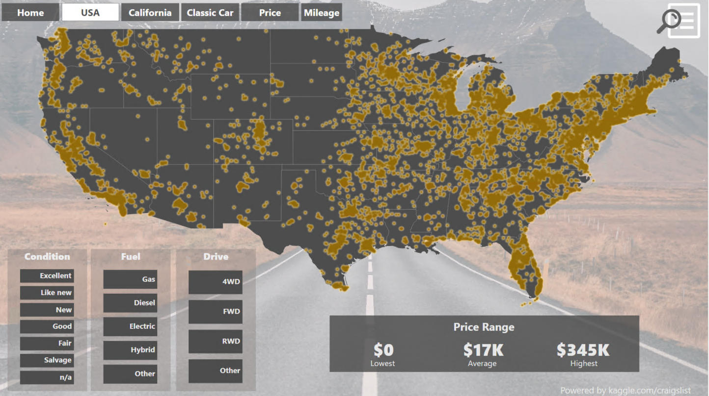
This dashboard was created for our maps visualization contest and it contains a lot of tips and tricks that really can help you in your daily work creating dashboards with TARGIT.
This tip - based on this dashboard - is around using barcharts as slicers.
Author of this dashboard: Stephan Fehrmann from TARGIT partner GOB
This is actually not just one dashboard - but a full portal giving you insight into the used car market in the US - if you take a look at the dashboard - don't hesitate to use the menu in the top - cause there's a lot of great stuff here besides the dashboard shown above.
However - in this particular dashboard, you might notice the slicers in the lower left corner:
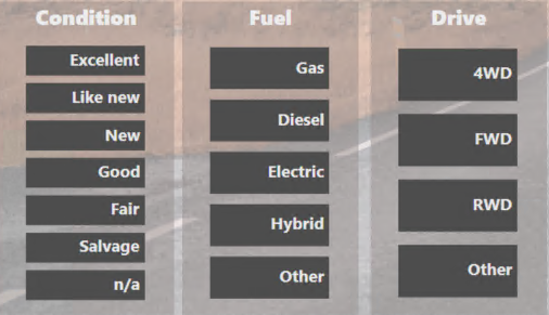
These are actually 3 barcharts - formatted to serve as slicers in this context.
Let's look at the properties of one of these barcharts - and particularly on the scale setup on the measure axis:
As you can see the scale goes from 0 to 0.1. That means that all the bars will "hit the ceiling" of the scale - and as a consequence they will have the exact same size.
This means that you now have a barchart - not meant to reflect the numbers behind - but only to serve an elegant graphical slicer - just by setting up a custom scale.
A great trick that can be reused in many contexts where you want a slicer that doens't have the table look, but has a more graphical look and feel.
Notice there is another great tricks based on this portal:
Comments
Really appreciated. Looks great.
But is there a way to avoid the infopopup (maximize, switch to table, etc), as this "blocks" the first bar to be selected... The whole charts should be kind of "locked", so even a expansion is not possible...
Cheers
Ingo
Hi Ingo,
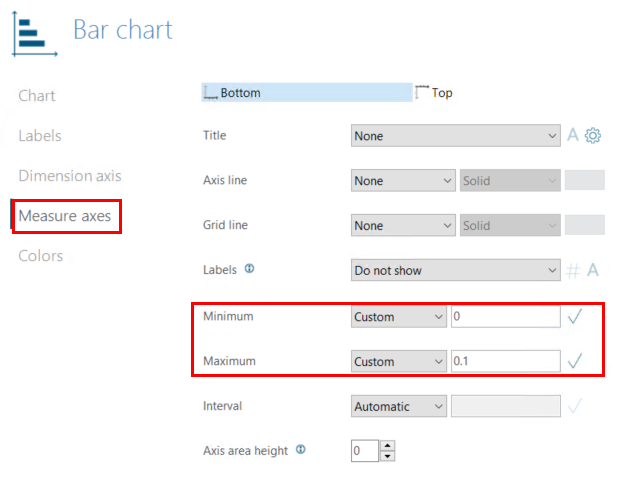
I just have an Workaround for the infopopup.... If you create an bar chart instead of column chart, you can change the axis area height:
before:
after:
Hi Marlene,
thank you so much for this hint.
This also works for a column chart (left axis instead of top), although I have to go for a width of 125.
Cheers
Ingo
Ah yes, like this:
Or you could use the 'Border Styling' feature (from version 22.02.25005).
I have found that by adding 40 pixels of padding at the top, the object toolbar gets out of the way. At the same time you might consider making the object 40 pixels higher and make the additional 40 pixels overlap any potential object located above the current object.
BR / Ole
Please sign in to leave a comment.